
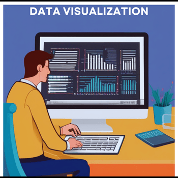
Data visualization involves using charts, graphs, maps, or timelines to represent data graphically. In the age of big data, effective visualization is essential for analyzing information and making informed decisions. Our brains naturally detect patterns, which aids in understanding complex data. Utilizing visual design principles can improve the clarity and impact of your figures, making your thesis more engaging and easier to comprehend. Incorporating tables, figures, and charts enhances data presentation and communication of research findings.
Important Aspects in Visual Data Visualization
1.Choose the Right Visual:
- Depending on the type of data and the message you want to convey, choose the appropriate visual format.
- Use tables for detailed numerical data, bar charts for comparisons, line graphs for trends over time, and pie charts for proportions.
2. Use Effective Geometry and Show Data
- Geometries, the shapes and features that define a figure, are crucial in data visualization, such as bar geometries creating bar plots.
- It may be tempting to default to familiar geometries, but exploring various options that best represent the data is important.
- The data-ink ratio—comparing the ink used for data display versus non-data ink—should guide these decisions, with higher data-ink ratios being preferable for minimizing unnecessary ink.
- Geometries typically fall into four categories: amounts, compositions, distributions, and relationships.
- A single dataset can often be visualized through multiple geometries, offering different insights.
- Understanding and selecting the appropriate geometry can significantly enhance data presentation.
3. Colors Always Mean Something
- Color is a powerful tool in visualization. Even if print limitations restrict color use, digital formats often permit it.
- Studies show that colorful visualizations have higher memorability, with seven or more colors being most effective.
- Choose light text on dark backgrounds for readability, different shapes to indicate distinct data sets, and varying sizes to highlight data frequency.
- Avoid vivid effects and abstract images that can distract from key information.
- Use visuals judiciously to enhance, not overwhelm, the presented data.
4. Simple Visuals, Detailed Captions
- High data-ink ratios are crucial, but detailed captions are equally important.
- Captions should fully explain the figure, enabling understanding even if viewed independently from the rest of the study.
- Some complex models may require more explanation than a caption can provide, but the goal is for captions to be as comprehensive as possible, elucidating the visualization and its representations.
Sources:
https://www.sciencedirect.com/science/article/pii/S2666389920301896
https://www.geeksforgeeks.org/data-visualization-and-its-importance/